Forskjell mellom versjoner av «Tutorial5»
Fra mn/ifi/camsem
| (4 mellomliggende revisjoner av 2 brukere er ikke vist) | |||
| Linje 1: | Linje 1: | ||
'''How to sort data by value and keeping the original label''' <br>I want to sort my columns in accordance to their height, and not the label. How do I do that?<br>First I start of making the columns. Here is the percentage of sick leave in the different counties in Norway, first quarter of 2007 in Norway: | '''How to sort data by value and keeping the original label''' <br>I want to sort my columns in accordance to their height, and not the label. How do I do that?<br>First I start of making the columns. Here is the percentage of sick leave in the different counties in Norway, first quarter of 2007 in Norway: | ||
| − | [[Image:Tutorial 5 bilde 1.JPG]]<br> <br>Here they are, as you see, sorted alphabetically by the name of the county. Nice and dandy, but imagine we are to compare two data series, i.e. to look for correlations. Then we may need to sort the bars by their size in one of the series instead. How to do that?<br> | + | [[Image:Tutorial 5 bilde 1.JPG|center|500px]]<br> <br>Here they are, as you see, sorted alphabetically by the name of the county. Nice and dandy, but imagine we are to compare two data series, i.e. to look for correlations. Then we may need to sort the bars by their size in one of the series instead. How to do that?<br> |
| − | First, we set the chart type to be Scatter.<br> [[Image:Tutorial 5 bilde 2.jpg]]<br>Then we set the same value in the x and y axis, both Avg: | + | First, we set the chart type to be Scatter.<br> [[Image:Tutorial 5 bilde 2.jpg|center|500px]]<br>Then we set the same value in the x and y axis, both Avg: |
<br> | <br> | ||
| − | [[Image:Tutorial 5 bilde 3.jpg]]<br> <br>The following graph should appear: | + | [[Image:Tutorial 5 bilde 3.jpg|center|500px]]<br> <br>The following graph should appear: |
<br> | <br> | ||
| − | [[Image:Tutorial 5 bilde 4.jpg]]<br> <br>Not very informative, but we are not quite done yet :-)<br>Set the type back to Vertical again: | + | [[Image:Tutorial 5 bilde 4.jpg|center|500px]]<br> <br>Not very informative, but we are not quite done yet :-)<br>Set the type back to Vertical again: |
<br> | <br> | ||
| − | [[Image:Tutorial 5 bilde 5.jpg]] | + | [[Image:Tutorial 5 bilde 5.jpg|center|500px]] |
| − | You may want to set the | + | You may want to set the plot type to Bar again, and turn off markers:<br> |
| − | [[Image:Tutorial 5 bilde 6.jpg]] | + | [[Image:Tutorial 5 bilde 6.jpg|center|500px]] |
| − | <br>Then we should have a nice graph, sorted by the value!<br> <br>[[Image:Tutorial 5 bilde 7.jpg]]<br> | + | <br>Then we should have a nice graph, sorted by the value!<br> <br>[[Image:Tutorial 5 bilde 7.jpg|center|500px]]<br> |
| + | <br> | ||
| + | <br> | ||
| + | '''CLUE!''' | ||
| + | <br> When copying the strange script from Advanced tab in the properties of the sorted graph, and pasting that into the Advanced tab in the properties of the unsorted graph, that as well get sortet! (Ceteris paribus). | ||
| − | + | <br> | |
| − | |||
| − | |||
| − | |||
| − | |||
| − | |||
| − | [[Image: | + | [[Image:Tutorial 5 bilde 8.JPG|center|500px]] |
Nåværende revisjon fra 8. jul. 2010 kl. 09:05
How to sort data by value and keeping the original label
I want to sort my columns in accordance to their height, and not the label. How do I do that?
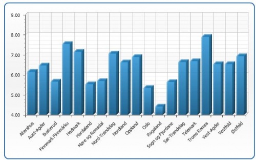
First I start of making the columns. Here is the percentage of sick leave in the different counties in Norway, first quarter of 2007 in Norway:
Here they are, as you see, sorted alphabetically by the name of the county. Nice and dandy, but imagine we are to compare two data series, i.e. to look for correlations. Then we may need to sort the bars by their size in one of the series instead. How to do that?
First, we set the chart type to be Scatter.
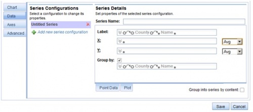
Then we set the same value in the x and y axis, both Avg:
The following graph should appear:
Not very informative, but we are not quite done yet :-)
Set the type back to Vertical again:
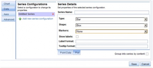
You may want to set the plot type to Bar again, and turn off markers:
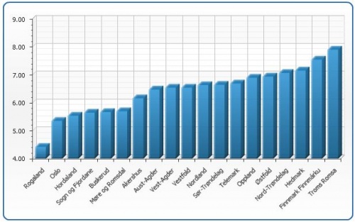
Then we should have a nice graph, sorted by the value!
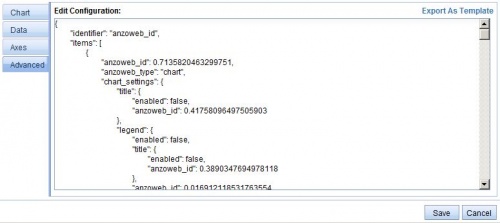
CLUE!
When copying the strange script from Advanced tab in the properties of the sorted graph, and pasting that into the Advanced tab in the properties of the unsorted graph, that as well get sortet! (Ceteris paribus).
