Difference between revisions of "Trust us, we're Scientists! Visualization/Description"
| Line 1: | Line 1: | ||
| + | = Introduction = | ||
| + | |||
The app has the options to select three different graphs: Trends, Comparisons and Proportions. | The app has the options to select three different graphs: Trends, Comparisons and Proportions. | ||
| Line 11: | Line 13: | ||
<br> | <br> | ||
| − | '''Trends''' | + | = '''Trends''' = |
The first graph is 'Trends'. It shows graph with selected data elements. | The first graph is 'Trends'. It shows graph with selected data elements. | ||
| Line 23: | Line 25: | ||
<br> | <br> | ||
| − | [[Image: | + | [[Image:Graph1 2.gif]] |
<br> | <br> | ||
| − | Currently the graph is showing data elements for 3 months. You can change the input duration in the settings menu and thus by swiping the mobile anywhere in the screen or by clicking the arrows you can see the graph for different duration. This can be very help ful for the users to see improvement by comparing with different time intervals. You can see the graph with the same data elements for 12 months below: | + | Currently the graph is showing data elements for 3 months. You can change the input duration in the settings menu and thus by swiping the mobile anywhere in the screen or by clicking the arrows you can see the graph for different duration. This can be very help ful for the users to see improvement by comparing with different time intervals. You can see the graph with the same data elements for 12 months below: |
| − | [[Image: | + | [[Image:Graph1 3.gif]] |
| − | <br> | + | <br> |
Swiping in pc | Swiping in pc | ||
| Line 37: | Line 39: | ||
<br> | <br> | ||
| + | <br> | ||
| − | + | = '''Comparison''' = | |
| − | '''Comparison''' | ||
The second graph is the comparison. It is used to compare value for indicator elements within the child organization. | The second graph is the comparison. It is used to compare value for indicator elements within the child organization. | ||
| Line 51: | Line 53: | ||
<br> | <br> | ||
| − | '''Proportions''' | + | = '''Proportions''' = |
The third and the final graph is the proportions. | The third and the final graph is the proportions. | ||
Revision as of 19:33, 5 December 2013
Contents
Introduction
The app has the options to select three different graphs: Trends, Comparisons and Proportions.
We also have a settings page, where the user can select different data period that they want to check graphs for using swipe for mobile and arrow for desktop pc. All the graphs are catched, so if you go to different page and come back to the earlier page, you will be able see to the graphs displayed earlier immediately without having to select the option once more. We have displayed graph for each option instead of displaying all the graphs to save bandwidth.
Trends
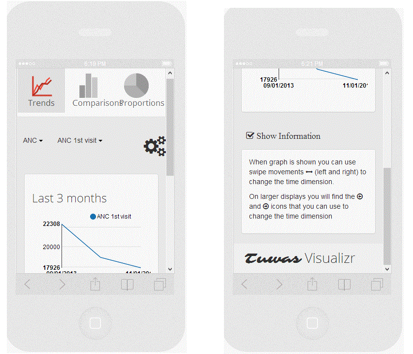
The first graph is 'Trends'. It shows graph with selected data elements.
If you scroll below, you can see the footer information in the graph that displays important information.
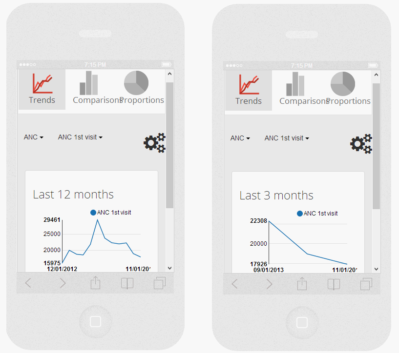
Currently the graph is showing data elements for 3 months. You can change the input duration in the settings menu and thus by swiping the mobile anywhere in the screen or by clicking the arrows you can see the graph for different duration. This can be very help ful for the users to see improvement by comparing with different time intervals. You can see the graph with the same data elements for 12 months below:
Swiping in pc
Comparison
The second graph is the comparison. It is used to compare value for indicator elements within the child organization.
Like in the trend, you can see the image for different time.
Proportions
The third and the final graph is the proportions.


